 |
{{display_<display type> <name=value pairs>}}
Each of these tags support the following attributes:
layoutHere="true"
showMenu="true"
showTitle="true"
title="Title to display"
If layoutHere is set to false then the component is laid out by the container group (below). Otherwise it is displayed in place.
Some of the displays use a color table:
colorTable="rainbow|grayscale|inversegrayscale|blues|blue_green_red|white_blue|blue_red"The full set of color tables can be viewed at here.
fields="active_voters,total_ballots"
Or:
fields="1,#2,#3"
The field ids for a point data entry can be viewed with the Metadata view, e.g. - (example).
{{display_linechart fields="#5,#6,#7,#8,#9,#10" }}
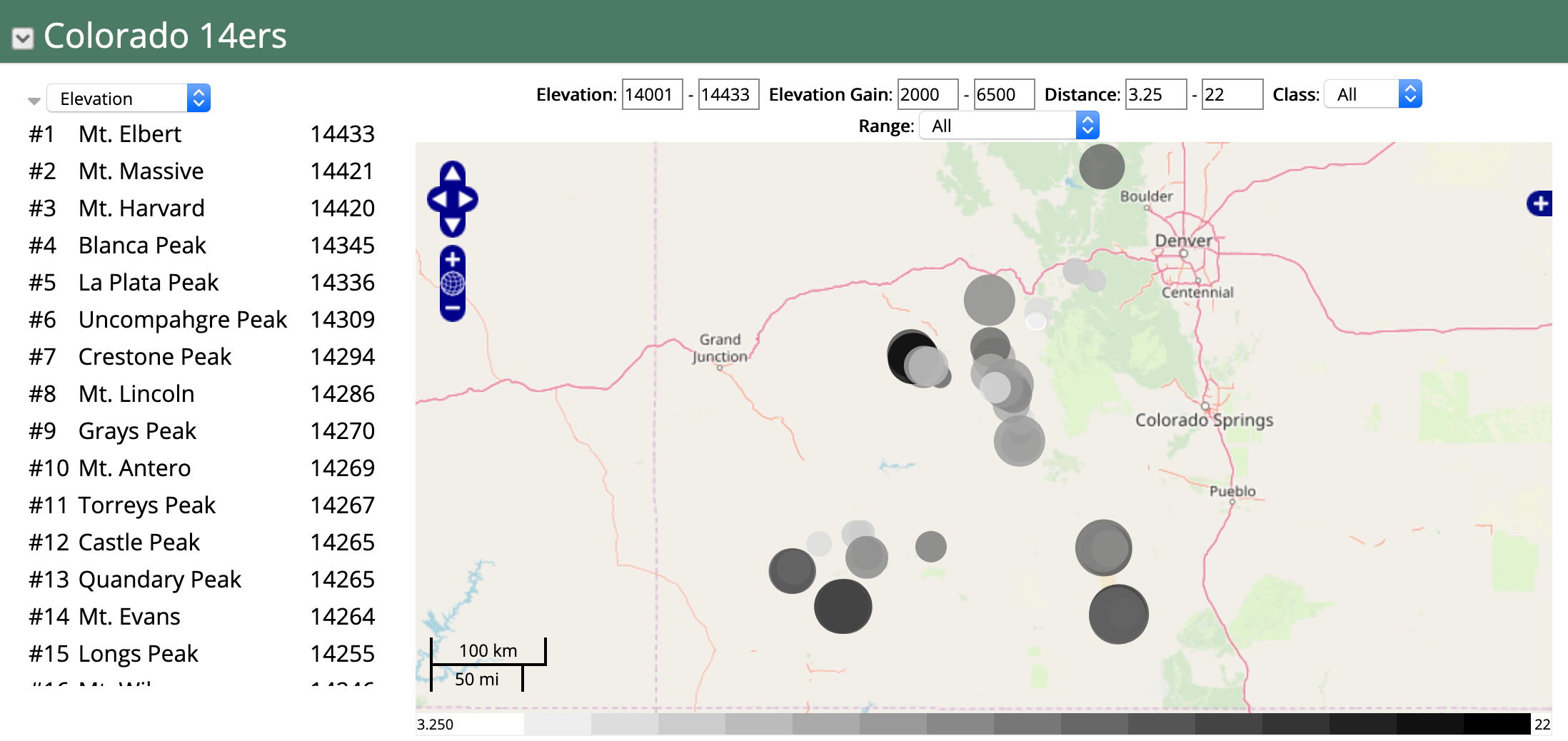
+row
+col-3
{{display  type="ranking"
...
filterFields="elev,elev_gain,distance,range,class" hideFilterWidget=true
 }}
 -col
 +col-9
{{display  type="map"
...
filterFields="elev,elev_gain,distance,class,range"
}}
 -col
 -row
Filter attributes:
convertData="command1;command2;...;"

Where commands can be:
  derived(field=field_id, function=some_expression)
e.g.:
  derived(field=poptimes10, function=population*10)

  rotateData(includeFields=true,includeDate=true,flipColumns=true)
  addPercentIncrease(replaceValues=false)
By date:
startDate="yyyy-MM-dd"
endDate="yyyy-MM-dd"

By value:
dataFilters="command(field=<field id>,value=<value>,enabled=<value>,label=<label>...


Where "command" can be one of:
match - string match
notmatch - string not match
lessthan - <=
greaterthan - >=
equals
notequals


If the label is specified then a selector checkbox will be shown to turn on/off this filter
You can also sample the data with:
stride=1 -  take every other point
maxDisplayedPoints= - if set, then set the stride so we at most have  maxDisplayedPoints points
You can bin the data based on dates with:
binDate=day|week|month|year
binType=total|count|average
Only show unique rows with:
uniqueField=<field id>
colorTable="some color table name" - specify the color table

colorTable="colors:red,green,blue,...."   - explicit list of colors

colorTable.<field name> ="some color table"  - specify a color table for one of the "color by" fields

colorTableInverse="true"   -reverse the colors

colorTableAlpha="0.0 - 1.0" - specify a transparency value

colorBy=<field name> - specify a data field to color by

colorByFields=<field1,field2,...,fieldN> - specify a number of fields to allow the user to choose how to color
{{group group 1 ...}}
{{display display 1}}
{{display display 2}}
{{display display 3}}

{{group group 2...}}
{{display display 4}}
{{display display 5}}
If showMenu is set to true for a group then the below menu is displayed. This supports the interactive creation of new charts and displays. The layout of these displays can be changed interactively, their state can be changed and they
can be deleted.


layoutType=tabs
layoutType=table
layoutType=columns
layoutType=rows
Using the table layout the number of columns is specified with the layoutColumns attribute. For the columns and rows layout type each child display can specify the column number of row number it should be placed in. For example, for the rows layout if you had:
{{group layoutType="rows"}}
{{display display1  row="1"}}
{{display display2  row="1"}}
{{display display3  row="1"}}
{{display display4  row="2"}}
{{display display5  row="2"}}
{{display display6  row="3"}}
Would result in (without the border):
| display1 | display2 | display3 |
| display4 | display5 |
| display6 |
The divid attribute allows you to specify a div tag that is in the wiki page as the location for the group and the displays to place themselves in. For example, below is the (abbreviated) wiki text used to create this page on ramadda.org. We want to have a fixed layout where the entry list is on the left and the map is on the right. Any charts or other display components that are interactively created by the user are managed by the group and layed out below the list and map. To do this we define a regular html table layout that contains a couple of div tags - one for the list and one for the map. We set the IDs of the div tags and then reference those IDs in the display wiki tags below. Likewise, the group has a divid=maindiv which corresponds to the div at the bottom of the page.
<table width=100% border=0 cellpadding=10>
<tr valign=top>
<td width=50%><div id="listdiv"></div></td>
<td width=50%><div id="mapdiv"></div></td>
</table>

<div id=maindiv></div>
{<noop>{group  layoutType="table"  layoutColumns="1" divid="maindiv"}}
{<noop>{display_entrylist   divid="listdiv" }}
{<noop>{display_map  layoutHere="true" height="250" divid="mapdiv"}}
{{group  changeEntries=true changeEntriesLabel="Select Region"
firstEntry="93198426-f87d-40e6-b206-43b25ad1d4fa"
}}

{{display_fieldslist width=150px
entry=93198426-f87d-40e6-b206-43b25ad1d4fa
fields="#41,#42,#43,#44,#45,#46,#47,#48,#49,#50"
...
}}

{{display_linechart
entry=93198426-f87d-40e6-b206-43b25ad1d4fa
fields="#41,#42,#43,#44,#45,#46,#47,#48,#49,#50"
...
}}
The above lists the entries in a menu. Alternatively you can display the entries in a map
or in a timeline.
{{display type="entrylist" width="800"
height="400"
orientation="vertical|horizontal"
showForm="true|false - is form shown"
formOpen="true|false - is form open"
showSearchSettings="true|false"
showType="true|false - show the type selector menu"
types="comma separated list of entry types to show"
doSearch="true|false - perform the search when the page is first displayed"
showToggle="true|false - show the form toggle"
showText="true|false - show the search text input"
showArea="true|false - show the map selector"
showDate="true|false - show the data selector"
showMetadata="true|false - show the metadata search fields"
metadataTypes="comma separated list of metadata types to show"
formWidth="width of the search form"
entriesWidth="width of the results list"
provider="google,arxiv,wolfram,..."}}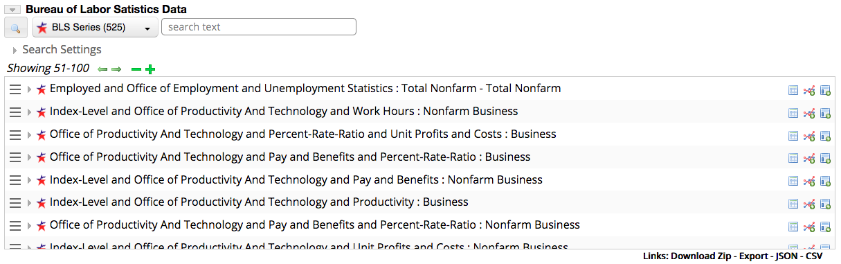
The metadataTypes attribute allows you to specify what metadata to show. The list of available metadata types can be viewed here.
In the search results list new displays can be created through the pull down menu:
{{display type="entrygrid" showIcon="true"  showName="true"  scaleWidth="true"  scaleHeight="false"
#xAxisAscending="true"
#xAxisScale="true"
#yAxisAscending="true"
#yAxisScale="true"
#urlTemplate="{url}|{entryid}|{resource}"
#height="400"  #width="100%"
#entries=""}}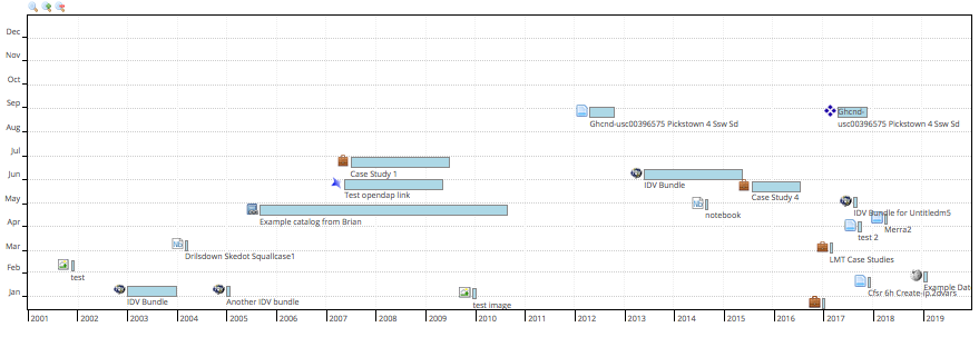
{{display type="animation"}}
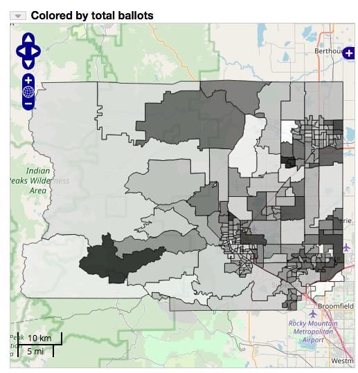
{{display type="map" width="100%"  height="400"
geojsonLayer="entry id of a geojson file"
geojsonLayerName="Layer name"
kmlLayer="entry id of a kml file"
kmlLayerName="Layer name"
pruneFeatures="true"
colorBy="total_ballots"
colorTable="inversegrayscale"
colorByMin="min value"
colorByMax="max value"
displayDiv="mapDisplay${entryid}"}}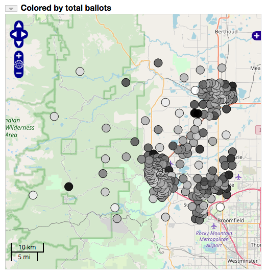
:heading Map
+row
+col-md-6
{{display_map column="1"  width="-100" height="500"   includeData="false"   showTitle="false"
title="Colored by total ballots"
geojsonLayer="7c8f5e25-e569-4ca9-b389-5bb03cdb138b"
geojsonLayerName="Precincts"
displayAsMap="true"
pruneFeatures="true"
colorBy="total_ballots"
colorBar="inversegrayscale"
displayDiv="mapDisplay${entryid}"
}}
-col
+col-6


:heading Map Details

-col
-row
Map Animation:doAnimation="true" - enable animation animationShowSlider="true" - show the slider animationDateFormat="yyyyMMdd" or "yyyy" - default is the fully formatted date animationMode="cumulative" or "sliding" - how the time window is moved animationSteps="60" - how many steps animationWindow="year" or "month" or "day" or "hour" or "minute" or "second" - override the animationSteps animationSpeed="250" - time in milliseconds between each stepMap Labels:
labelTemplate="text template with ${field id} macros. Use _nl_ for new lines"
labelFontColor="#000"
labelFontSize="12px"
labelFontFamily="'Open Sans', Helvetica Neue, Arial, Helvetica, sans-serif"
labelFontWeight="plain"
labelAlign="lb"  //See http://dev.openlayers.org/docs/files/OpenLayers/Feature/Vector-js.html
align is of the form "hv" where h is "l|c|r" (left, center, right)  and v is "t|n|b" (top,middle,bottom)
labelXOffset="0"
labelYOffset="0"
labelOutlineColor="#fff")
labelOutlineWidth="0"
Map Sizes//Define the point radius radius="4" //define a field to size by sizeBy="<field>" //use a log scale sizeByLog=true //Size min/max sizeByRadiusMin=1 sizeByRadiusMax=15Map Colors
//Field to color by
colorBy="<field>cnt"
//Color table
colorTable="blue_green_red"
//Or colors
colors="color1,color2,...,colorN"
//Use a log scale
colorByLog=true
//Set the stroke color
strokeColor="#fff0"
//Map string values to colors
colorByMap="value:color,...,value:color"

//These are used in conjunction with a vector map layer
//If true then count the points within each map feature and use that as the color by value
colorByCount=true
//Suffix to show on map click
doCountLabel="clubs"

//If true then prune out the features that don't have any data points in them
pruneFeatures="true"
Map Shapes
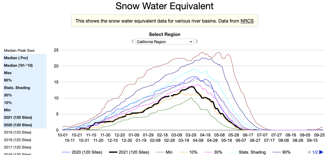
//Define a different icon to use pointIcon="/repository/dutchbrothers.png" //Define a different shape shape="star|cross|x|square|triangle|circle|lightning|rectangle|church" //Map values to shape shapeBy=<field> shapeByMap="value1:shape1,...,valueN:shapeN"Displays time series or indexed point data. The vAxisMinValue and vAxisMaxValue are used as the range instead of the min/max from the data.
{{display type="linechart" width="800"  height="400"
fields=""
vAxisMinValue="0" vAxisMaxValue="1.0" padRight="true"}}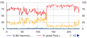
chart.fill="color or 'transparent'"
chart.stroke="stroke color"
chart.strokeWidth="width"

chartArea.fill="color or 'transparent'"
chartArea.stroke="stroke color"
chartArea.strokeWidth="width"

hAxis.gridlines.color="color"
vAxis.gridlines.color="color"
Annotating Charts
  annotationFields="field1,field2,..."
  annotationLabelField="field" //optional for the label
The second way is to specify the annotations using an annotations attribute:
annotations="
<,index1>,label1,description1;
<,index2>,label2,description2;
...
"
Where <index> is either a date or a numeric index, e.g;
 annotations="
2,A,annotation 1;
2016-06-24,B,annotation 2;
2016-06-24,C,<,h1>,annotation 3</h1>
2017-01-02,D,annotation 4
"
{{display type="barchart" fields="" padRight="true"}}
{{display type="barstack" fields=""}}{{display type="areachart" width="800" height="400"
fields=""
vAxisMinValue="0" vAxisMaxValue="1.0"
padRight="true"
isStacked="true"}}
{{display type="scatterplot" width="800" height="400" fields=""}}
{{display type="histogram" width="800"  height="400"  fields=""
colors="comma separated color list"
legendPosition="none|top|right|left|bottom"
textPosition="out|in|none"
isStacked="false|true|percent|relative"
logScale="true|false"  scaleType="log|mirrorLog"
vAxisMinValue=""  vAxisMaxValue=""
minValue=""  maxValue=""}}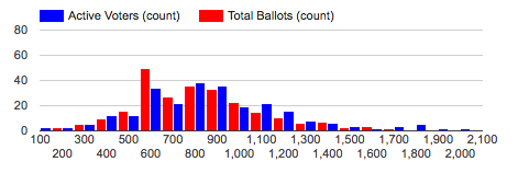
{{display type="bubble" width="500"  height="500"
fields="label|x|y|color|size"
colorTable=""
colors="comma separated color list"
legendPosition="none|top|right|left|bottom"
hAxisFormat="none|decimal|scientific|percent|short|long"
vAxisFormat="none|decimal|scientific|percent|short|long"
hAxisTitle=""
vAxisTitle=""}}{{display type="piechart" fields=""
pieHole="0.5"
is3D="true"
bins="bin count"
binMin="min"
binMax="max"
sliceVisibilityThreshold="0.01"
width="500" height="250"}}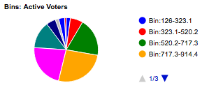
{{display type="radar" fields=""}}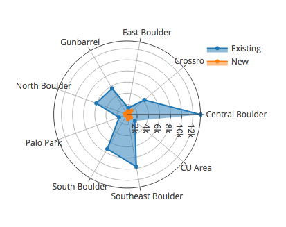
{{display type="windrose" fields=""}}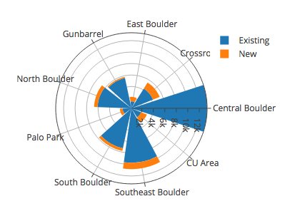
{{display type="density" fields="tmax,vp"}}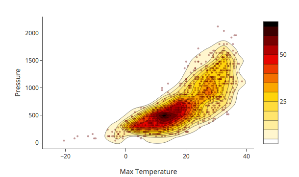
{{display type="3dscatter" fields=""}}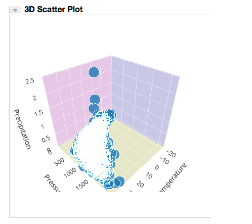
{{display type="calendar" fields="" cellSize="15" missingValue="0"}}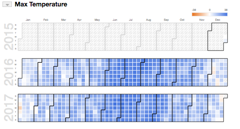
{{display type="gauge" fields="" gaugeMin="" gaugeMax="" gaugeLabel=""}}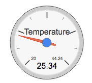
| 5.3.0 |
The Basics
|
| 5.3.1 |
Specifying Fields
|
| 5.3.2 |
Filtering Data
|
| 5.3.3 |
Converting Data
|
| 5.3.4 |
Subsetting Data
|
| 5.3.5 |
Color
|
| 5.3.6 |
Display Groups
|
| 5.3.7 |
Displaying Multiple Entries
|
| 5.3.8 |
The Displays
|
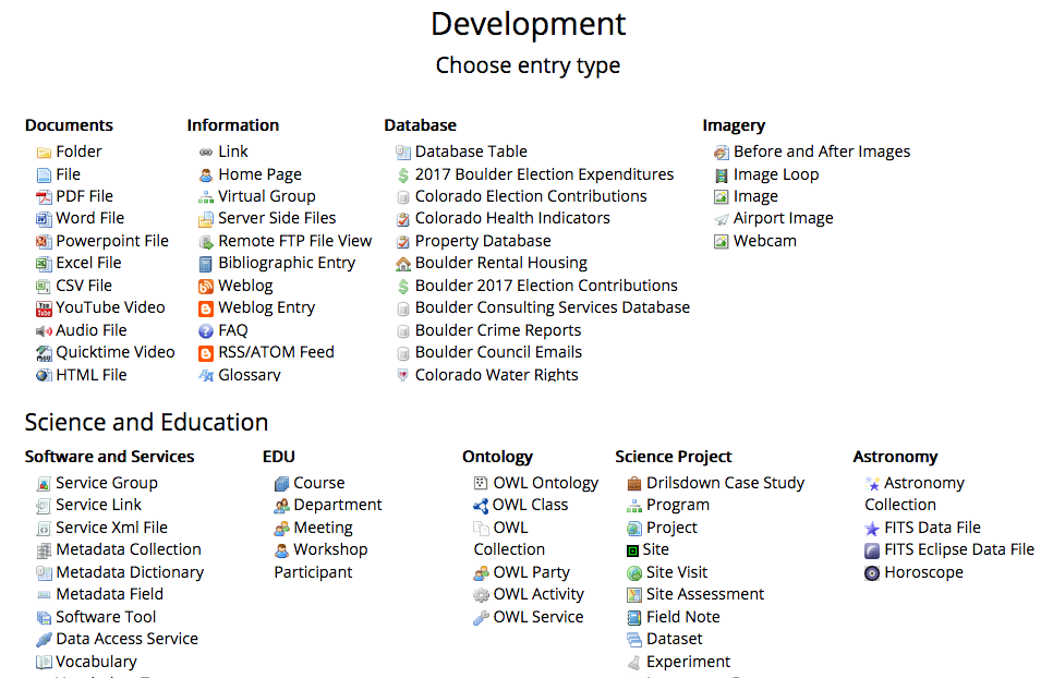
 Data Cart
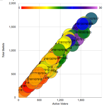